One Dataset, Eight Shapes
Using simulated annealing to create eight different scatterplot shapes with matching summary statistics to two decimal places.
Overview
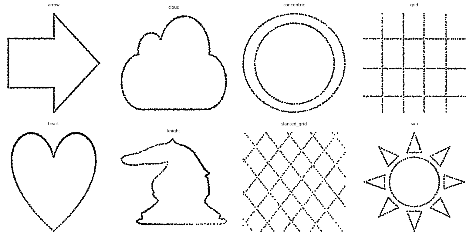
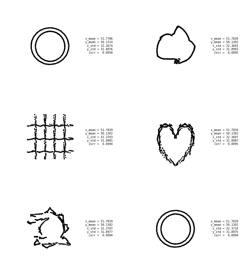
Anscombe's quartet demonstrates that datasets with the same summary statistics can look completely different when plotted. This experiment follows the same idea: starting from a set of points arranged in two concentric circles, we generate seven other datasets shaped like an arrow, a cloud, a grid, a slanted grid, a heart, a chess knight and a sun.
Each dataset contains 500 points and shares the same mean and standard deviation in both axes, together with the same Pearson correlation, when rounded to two decimal places. The final shapes are visibly distinct despite being indistinguishable by those five statistics.
The statistics
The constrained quantities are the means $\bar{x}$ and $\bar{y}$, the sample standard deviations $s_x$ and $s_y$, and Pearson's correlation $r$. The table below is calculated directly from the final datasets.
| Shape | $n$ | $\bar{x}$ | $\bar{y}$ | $s_x$ | $s_y$ | $r$ |
|---|---|---|---|---|---|---|
| Arrow | 500 | 51.78 | 50.13 | 32.37 | 31.90 | 0.01 |
| Cloud | 500 | 51.78 | 50.13 | 32.37 | 31.90 | 0.01 |
| Concentric | 500 | 51.78 | 50.13 | 32.37 | 31.90 | 0.01 |
| Grid | 500 | 51.78 | 50.13 | 32.37 | 31.90 | 0.01 |
| Heart | 500 | 51.78 | 50.13 | 32.37 | 31.90 | 0.01 |
| Knight | 500 | 51.78 | 50.13 | 32.37 | 31.90 | 0.01 |
| Slanted grid | 500 | 51.78 | 50.13 | 32.37 | 31.90 | 0.01 |
| Sun | 500 | 51.78 | 50.13 | 32.37 | 31.90 | 0.01 |
The statistics match at two-decimal precision. The underlying correlations range from approximately $0.005$ to $0.015$, so they all appear as $0.01$ in the table.
Seeding from SVG
Each target shape is stored as one or more SVG paths. We sample more points from longer path segments, discard any outside the SVG viewport and flip the vertical coordinate to use the usual Cartesian orientation. The concentric-circle cloud is centred and uniformly scaled into a $100\times100$ box. From it we draw 500 points without replacement and add a small amount of Gaussian noise, producing the seed dataset shown below.
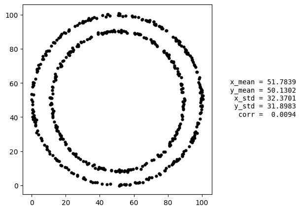
Before each run, the target cloud is shifted and scaled independently on each axis to match the seed's means and standard deviations. A distance field precomputed from this cloud then gives the distance from any proposed point to the target shape.
Simulated annealing
The dataset is moved towards the target using simulated annealing. At each step, one point is selected and given a small random displacement. The energy of a dataset $X$ relative to a target shape $C$ is
$$ E(X)=\sum_i d(x_i,C)^2 +\lambda\sum_{i<j}\max\!\left(0,r_0-\lVert x_i-x_j\rVert\right)^2. $$
The first term pulls the points towards the target. The second is a short-range repulsion that discourages them from collecting on one part of the outline. Moves that lower the energy are accepted. Moves that raise it are accepted with probability $e^{-\Delta E/T}$, where the temperature $T$ decreases over the run.
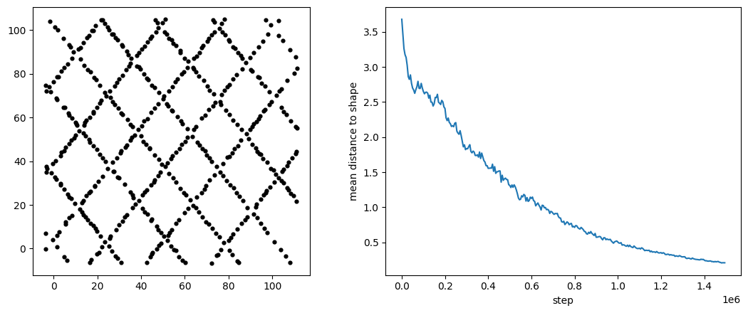
A move is only kept if the two means, two standard deviations and correlation still match the initial dataset to two decimal places. Repeating this for 1.5 million proposed moves gradually rearranges the seed dataset into the chosen shape.
Over $K$ proposed moves, indexed by $k=0,1,\ldots,K-1$, the temperature follows the geometric schedule $$ T_k=T_0\left(\frac{T_f}{T_0}\right)^{k/(K-1)}, \qquad T_0=60,\quad T_f=0.05. $$ Early in the run this allows the points to move away from the outline and explore other arrangements. Later, energy-increasing moves become increasingly unlikely and the cloud settles around the target.
Results
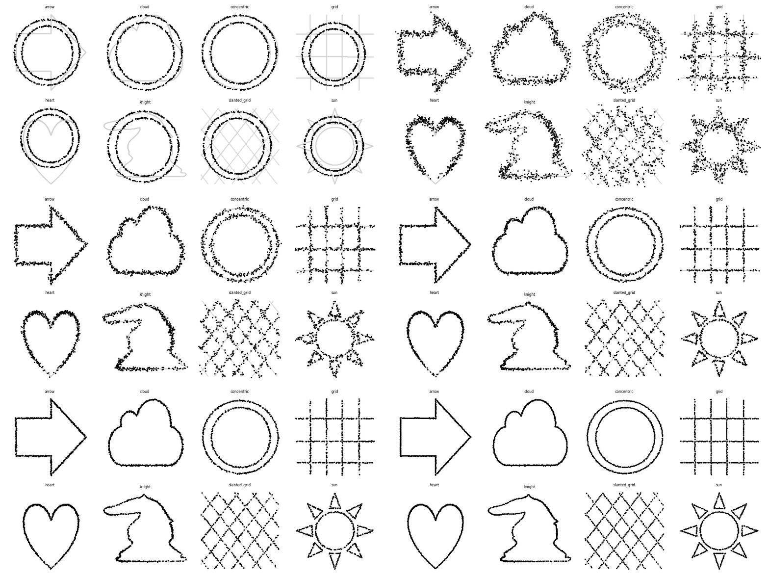
The final datasets reproduce all eight target shapes while retaining the statistics in Table 1. To animate the transitions, we match each point in one dataset to a point in the next and interpolate their positions. The animation shows the original run, with the five statistics displayed alongside the points. At four decimal places, small differences between frames are visible.
Implementation
Moving one point changes only its contribution to $\sum x$, $\sum y$, $\sum x^2$, $\sum y^2$ and $\sum xy$. Keeping these five running sums makes it possible to test a proposed move without recalculating the statistics over all 500 points. The core constraint check is shown below.
aX, aY = Sx + nx - ox, Sy + ny - oy
if round(aX / n, decimals) != tx or round(aY / n, decimals) != ty:
    continue

aXX = Sxx + nx * nx - ox * ox
aYY = Syy + ny * ny - oy * oy
x_std = math.sqrt((aXX - aX * aX / n) / (n - 1))
y_std = math.sqrt((aYY - aY * aY / n) / (n - 1))
if round(x_std, decimals) != tsx or round(y_std, decimals) != tsy:
    continue

aXY = Sxy + nx * ny - ox * oy
corr = ((aXY - aX * aY / n) / (n - 1)) / (x_std * y_std)
if round(corr, decimals) != tc:
    continue
The complete notebook and generated dataset can also be downloaded directly.
References
Matejka, J. & Fitzmaurice, G. (2017). Same Stats, Different Graphs: Generating Datasets with Varied Appearance and Identical Statistics through Simulated Annealing. CHI 2017.